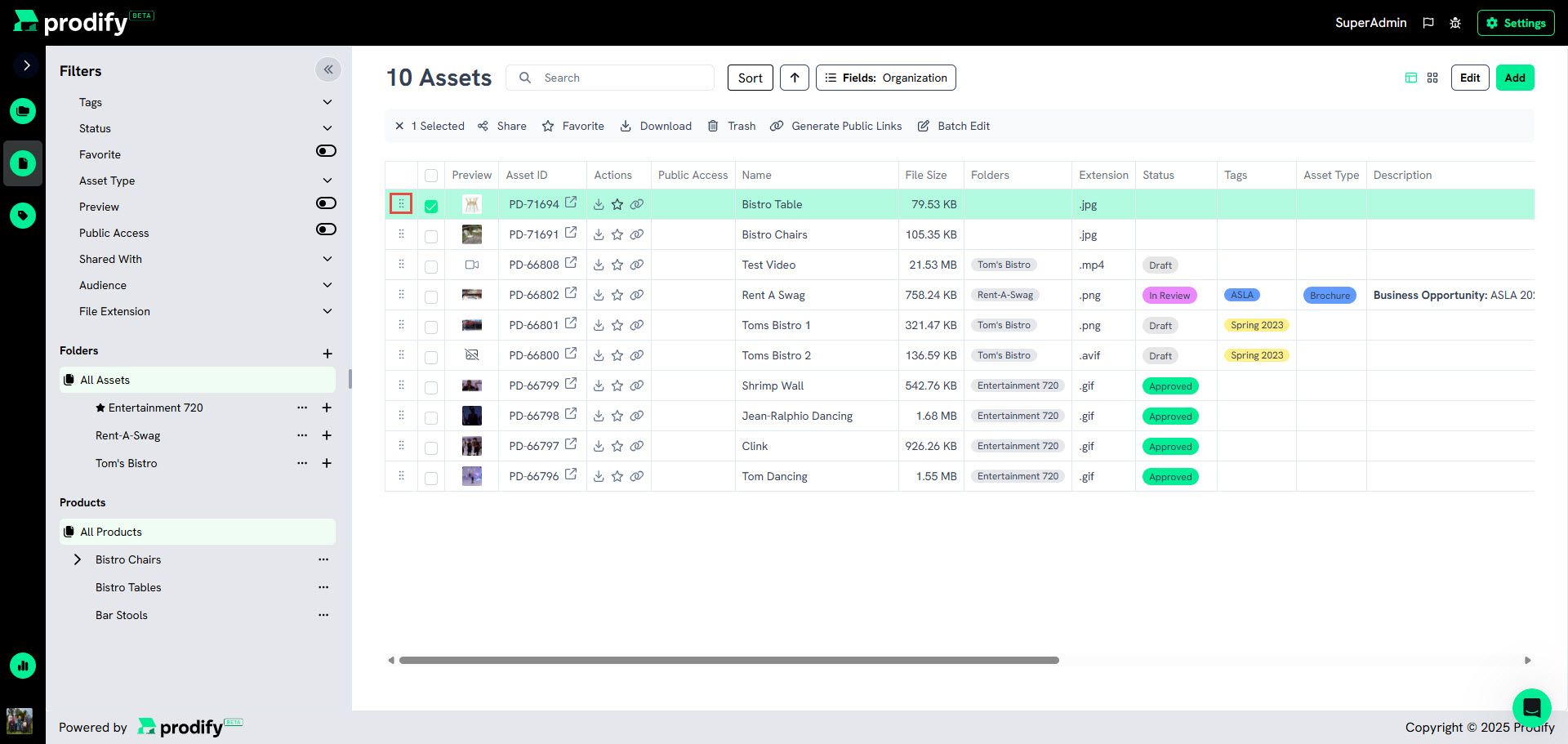
UX Feedback: Dotted Icon on Assets Chart Suggests Drag Functionality
Just a quick note from a user perspective — the small dotted icon on the far left side of the assets chart (see attached screenshot) gives the impression that assets might be draggable. I realize it's there for aesthetic purposes, but I found myself wanting to use it to move items around. Not a major concern, just something to consider in case it influences user expectations. Thanks!
Please authenticate to join the conversation.
Upvoters
Status
In Review
Board
💡 Feature Request
Tags
Medium Priority
+1
Date
9 months ago
Author

Alice Krawczyk
Subscribe to post
Get notified by email when there are changes.
Upvoters
Status
In Review
Board
💡 Feature Request
Tags
Medium Priority
+1
Date
9 months ago
Author
Alice Krawczyk
Subscribe to post
Get notified by email when there are changes.