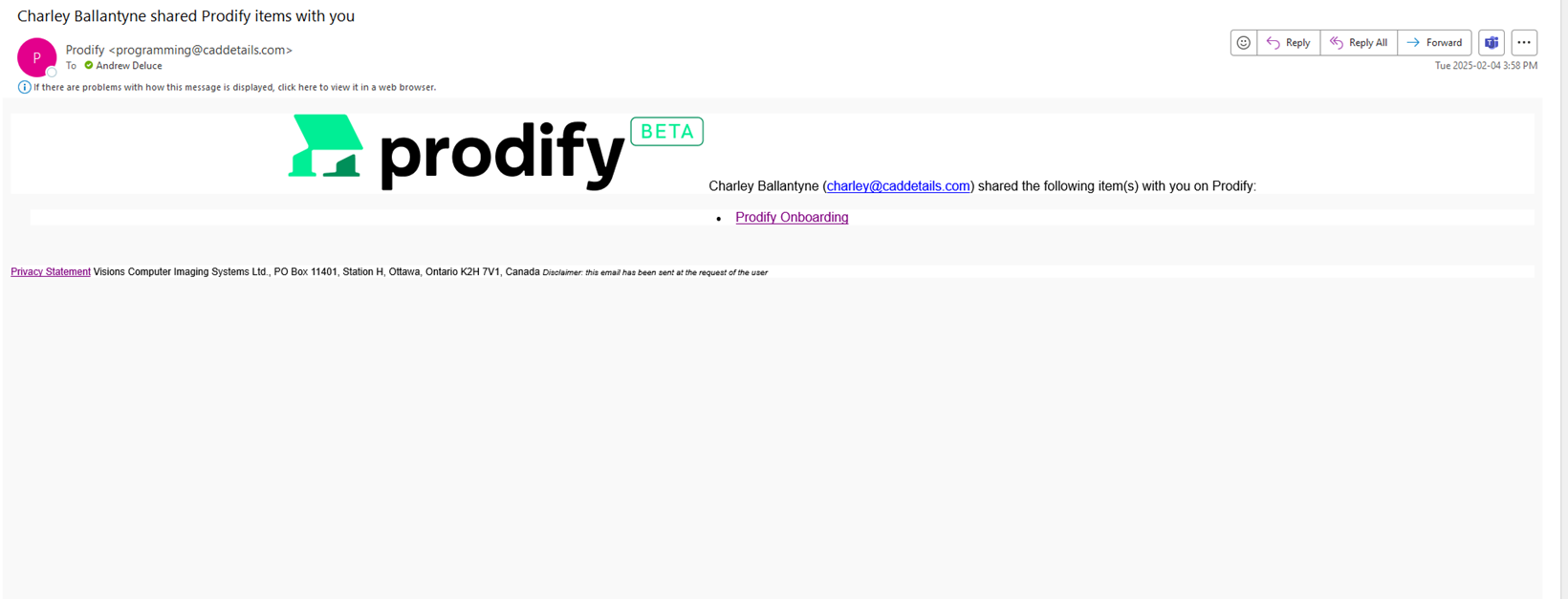
Sharing Email Formatting🔵
Not sure if this has been addressed yet, but the formatting that the email comes across needs to be cleaned up to more of a standard format. A couple of comments
-Name of person sharing is off to the left beside the logo. Logo should be centered at the top, with subsequent information cascading down
-Link to what was shared is also somewhat hidden and not intuitive, and looks clunky when there are lots of items shared. Recommend checking out Dropbox / other platforms
-May want to also not other text that these platforms usually have in their sharing emails such as “if this information has been shared by accident, please delete, etc.”
Screenshot below:
DESIGN from Erin:
Please see a link to the design here and let me know if you need anything else from my end!
VIDEO from Deluce: 0:18 to 1:20 Email received by the user - Domain is CADdetails. It should be @tryprodify.com . Formatting - look at standard practice for layout and format. Prodify Sharing - Video #1 (AD).webm
Please authenticate to join the conversation.
Addressed elsewhere
🐛 Report an Issue
Medium Priority
Over 1 year ago

andrew
Subscribe to post
Get notified by email when there are changes.
Addressed elsewhere
🐛 Report an Issue
Medium Priority
Over 1 year ago
andrew
Subscribe to post
Get notified by email when there are changes.